Feed Me Data ingests tech and AI news from about 7,400 sources. The corpus is past 240,000 articles and growing every half hour. The first question anyone asks about a pile like that is also the simplest: how fresh is it?
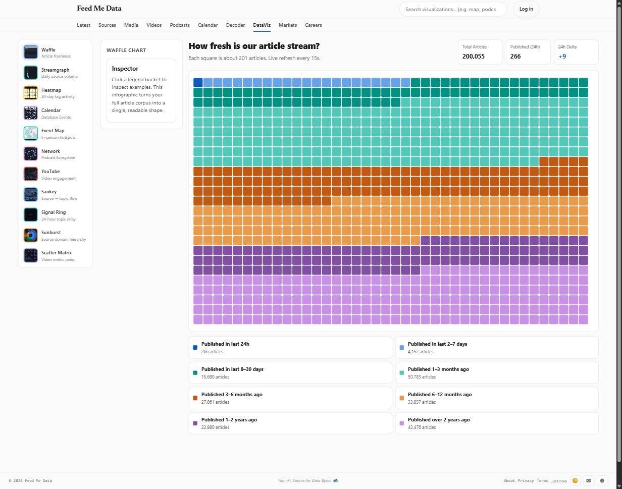
The /dataviz page answers with a waffle chart: 1,000 rounded squares, each standing for roughly 243 articles, colored by how long ago the article was published. It looks like the simplest visualization on the page. It went through more design revisions than any of the others, and every revision came from the same root cause: a waffle chart is a promise that the reader can match any square to a label. Break that promise and you have decoration, not data.
This post is the story of the chart in three acts: the data underneath it, the bucketing, and the color system, including the two designs we shipped before the one that survived contact with a phone.
Act I: the data is messier than the chart admits
The chart's honest name would be "distribution of effective publication dates," because raw scraped dates lie in at least three ways:
- Missing dates. Plenty of feeds and scraped pages carry no usable
published_atat all. For those rows we fall back to the ingest timestamp, the date we first saw the article. - Future dates. Parsers occasionally read a date out of body text or a sidebar and produce an article "published" months from now. Any publish date more than a day in the future is replaced with the ingest date.
- Publish-after-ingest. If a row claims it was published more than 30 days after we ingested it, the publish date is untrustworthy (we can't have scraped an article before it existed), so the ingest date wins.
In SQL, the whole policy is one CASE expression:
CASE
    WHEN published_at IS NULL THEN created_at
    WHEN published_at > now + 1 day THEN COALESCE(created_at, published_at)
    WHEN published_at > created_at + 30 days THEN created_at
    ELSE published_at
END AS effective_published_at
Two more filters shape the population before bucketing: only articles from English-language sources (the site's browsing surface), and nothing an editor or the content screen has hidden. That leaves ~242,000 eligible articles on the dev corpus, ~200,000 on production.
Each correction is also counted, and the counts ship in the API payload for admin users: a small data-quality tile next to the chart showing how many rows fell back to ingest dates, how many future dates were corrected, and how many publish-after-ingest rows were repaired. That tile has already paid for itself once: it's how we spotted a scraper that was stamping ingest times (with telltale microseconds) into published_at for tens of thousands of rows, which led to a backfill pipeline that re-fetches real dates.
The aggregates run in a DuckDB sidecar over the SQLite database (with a plain SQLite fallback and a short-lived cache), because the one thing a chart must never do on this site is block the request path. We learned that lesson the hard way from an 8.7-second tag aggregate (a different blog post).
Act II: the bucket that ate the chart
Version one had four buckets: last 24 hours, 2–7 days, 8–30 days, and "over 30 days ago." Reasonable-sounding, and useless, because the last bucket held 92% of the corpus. The waffle was a field of one color with a thin colorful strip at the top. A reader asked, fairly: what's actually in there?
Before redrawing anything we queried the real distribution across candidate boundaries. That step matters: bucket edges chosen for round numbers can land in empty territory. These came back with genuine mass everywhere:
| Bucket | Articles (dev corpus) |
|---|---|
| Last 24h | varies by hour |
| 2–7 days | ~300 |
| 8–30 days | ~19,000 |
| 1–3 months | ~64,000 |
| 3–6 months | ~33,000 |
| 6–12 months | ~41,000 |
| 1–2 years | ~29,000 |
| Over 2 years | ~56,000 |
Eight buckets, every one of them a real cohort: the current day, the current week, the current month, the last quarter, the half-year, the year, last year's archive, and the deep back-catalog. The chart finally said something: most of what we hold is archive, and you can see exactly how the archive shades from "recent enough to resurface" to "evergreen."
The squares themselves are allocated by largest remainder, so the thousand dots always sum to exactly 1,000 and no non-empty bucket disappears: a bucket with one article still gets its one square. Area is the encoding; color only carries identity. Which brings us to the act where we got it wrong.
Act III: color, twice
Round one: the textbook answer
Age is an ordered quantity, and the textbook encoding for an ordered scale is a sequential ramp: one hue, monotone lightness. We built one properly: eight steps of the site's accent blue, generated in OKLCH, validated for monotone lightness, a minimum lightness gap between adjacent steps, and a floor on how faint the palest step could get against each theme's surface. Every check passed. We shipped it.
Then came the feedback, from a phone, in light mode: the colors are so close I can't tell the ranges apart.
The user was right, and the reason is worth internalizing. A sequential ramp is the correct encoding when the reader's task is magnitude, "darker means more," as in a heatmap. But a waffle is a part-to-whole chart. The reader's task is identity: look at a square, find its legend entry, read the count. Eight steps of one hue sit at the outer edge of what humans can match back to a legend under ideal conditions, and a phone in daylight is not ideal conditions. We had validated the palette for the wrong job.
Round two: hue families
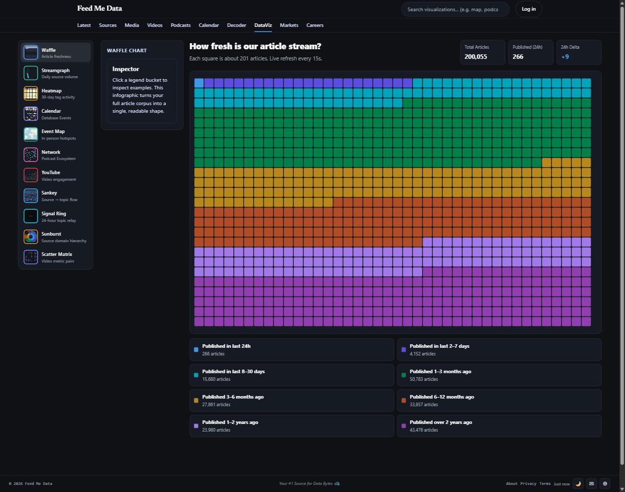
The fix keeps the order legible while making every bucket unmistakable: four hue families of two. Blues for days, teals for the weeks-to-quarter range, ambers for months, plums for years. Within each family, a strong light/dark split; between families, a big hue jump. Every adjacent pair of buckets now differs by either a lightness cliff or a hue cliff, never a subtle step. As a bonus, the two-column legend lines up so each row is one family.
Each theme got its own validated palette rather than an automatic flip:
- Light (on white):
#0d5ac2 #66a3e8 · #009180 #52c8b8 · #c05a12 #e89b4b · #8050a3 #c791e6 - Dark (on
#161a22):#3f97e8 #5b4de0 · #00a4bb #00814a · #b8891a #b04d24 · #a179e8 #8f3fae - Reading (on cream):
#2b5faa #638fd9 · #007d5c #45bd9d · #b35310 #dd9a4e · #7b4f96 #bd93d6
"Validated" means computed, not eyeballed, against six checks per palette: every color inside the mode's OKLCH lightness band, chroma above the reads-as-gray floor, adjacent pairs separated under simulated protanopia and deuteranopia, a hard separation floor for normal vision, and contrast against the chart surface, with the rule that any low-contrast pastel is only legal because the chart supplies relief: a visible gap between squares and a fully labeled legend with counts.
Dark mode fought back. Its usable lightness band is narrow (bright colors glare, dim colors vanish), so same-hue pairs can't get far enough apart on lightness alone. The dark palette solves it with wider hue splits inside each family (azure/indigo, cyan/green, amber/rust, lavender/plum), looser as a family metaphor, but every pair still reads.
The alternatives that lost
Before settling, we stress-tested the field. We pulled 42 palettes from a popular palette-inspiration site and ran them through the same validator: zero of the 37 multi-hue palettes passed, in either theme. Aesthetic palettes optimize for harmony. They choose analogous hues, they stretch lightness for drama, and they soften the set with a neutral, and every one of those choices breaks a chart. Then we tried the canon: ColorBrewer, Tableau 10, Observable 10, Okabe-Ito, Paul Tol. Every one of them also failed raw against our actual surfaces, tripping on pale yellows or deliberate grays. The lesson generalizes: palette libraries are hue-inspiration sources. The last mile, re-stepping lightness and chroma for your surfaces and re-validating, is never done for you.
We also designed two bespoke narrative palettes as challengers: "Aged Paper" (crisp blue ink fading to sepia, the way archives literally yellow) and "Thermal" (hot-off-the-press red cooling to cold indigo). Both passed every adjacent-pair check. Both failed a test the validator doesn't run by default: global look-alikes. Any single-narrative arc funnels several buckets into one hue neighborhood, so two non-adjacent buckets end up as twins: two mid-blues in Thermal's dark variant, two ambers in Aged Paper's. Measured across all pairs instead of adjacent ones, the hue-family palette beat both challengers in both themes. Render your chart and look at it; then look at what your checks didn't check.
What we'd tell you to steal
- Normalize dates before you visualize them, and count your corrections. The admin quality tile found a scraper bug the chart itself would have quietly absorbed.
- Query the distribution before choosing buckets. Edges should trace real cohorts, not round numbers, and no bucket should hold 92% of anything.
- Match the encoding to the reader's task, not the data's type. Ordered data does not automatically mean sequential ramp. A waffle is an identity task; identity wants distinct colors.
- Validate color computationally, per theme, against your real surfaces. Dark mode is its own palette, not an inversion, and its narrow lightness band will force different structural choices.
- Adjacency checks aren't global checks. Legend matching is all-pairs; make sure no two buckets anywhere in the set are twins.
- Low contrast is a debt that must be paid elsewhere. We pay it with gaps between marks, with legends that carry counts, and with click-to-isolate, and we use all three at once.
The waffle now does what it always claimed to do: turn a quarter-million timestamps, scraped and then corrected and deduplicated, into one shape that reads on a phone in any theme, whatever your color vision. That's the whole job of functional art: the art is negotiable, the functional is not.